DATA VISUALIZATION
the convergence of art, science, and technology for digital storytelling
explore our 3D virtual gallery
Join below for the fullscreen virtual gallery experience
or scroll down to browse the embedded gallery room below.
We invite you to join our virtual gallery opening
Friday, March 19th from 1-3 PM
to meet the artists, discuss data visualization, and explore our 3D space.
This quarter I led a data visualization collective that brought together a group of bright, driven students at the undergraduate and graduate levels from diverse fields such as Art: Games and Playable Media, Computational Media, Ecology and Evolutionary Biology, & Astronomy and Astrophysics. These students worked together with UCSC scientists to create five types of data visualizations: graphical abstracts with custom graphics, publication-ready figures coded in R, Python, or Javascript, animations (2D and 3D) visualizing critical scientific concepts, interactive websites (RShiny, HTML/CSS/Javascript, ObservableHQ, Jupyter Notebooks, etc.), as well as final projects combining concepts from throughout the quarter.
This webpage showcases the incredible work they have created this quarter and explains the structure and content of the collective. Visit the links below to learn more:

MEET THE STUDENTS

This word cloud shows the words
used by each student when they
spoke about their experience
and identity at the intersection
of art, science,
and coding.

This spider plot
shows the backgrounds
of each of the students with respect to the programs and coding languages we used to create data visualizations (before the collective)..
Final Projects
Browse projects by artist


Read more Below
The gallery below contains a brief description of each student's final project, including the skills they learned and the process they used. If you would like to see more, click on their website or explore their source code.

Ricardo Yarza
Astronomy and Astrophysics PhD Student
I have scientific experience only. I'm familiar with analysis and visualization in Python (matplotlib) and have very basic Illustrator and HTML knowledge.
Hydrodynamical simulations of weak encounters between stars and black holes

This series of plots and videos visualizes weak interactions between a star and a black hole, focusing on the changes in the internal structure of the star.
I generated the data using hydrodynamical simulations. I used Python to analyze the output of these simulations (HDF5). I made the plots using matplotlib, and the movies by generating each frame in matplotlib then putting them together with ffmpeg.
Data collected and analyzed by Ricardo Yarza.

Ishana Shukla
Ecology & Evolutionary Biology Major
I am a scientist that uses coding (R, ArcGIS, etc) to build models and help me analyze my data. I have experience in line drawings, graphite drawings, and acrylic paintings.
Human impacts on trophic activity patterns

This website provides an overview on an ongoing research project that studies human-induced changes in temporal overlap between multiple predator-prey couples.
This data set is comprised of 60 predator-prey or top predator-mesopredator couplings. For each coupling, the temporal activity for each trophic level was recorded in both low human disturbance and high human disturbance conditions. We then analyzed that data and calculated the change in the factor of temporal overlap in R, and plotted the change of overlap for each pairing. This data visualization will be incorporated into a future publication on how human-based activity affects temporal cascades throughout all trophic levels.
Data collected and analyzed by Ishana Shukla.

Megan Penland
Ecology & Evolutionary Biology Major
I would describe myself as a scientist 1st and an artist 2nd, with a background in a animation (slightly more 3d than 2d) and illustration.
Collateral Damage: Bycatch in Fisheries

This website provides insight into ongoing research examining the various aspects and consequences of bycatch from 5 major tuna commissions.
I created a website in Visual Studio Code, GitHub, CSS, and Javascript. On the webpage, I uploaded my data visualizations: (1) The graphical abstract shows that the estimated catch rate of by catch from these commissions does not match the data stated from these companies of their bycatch—with only one of the affected species (Silky shark) illustrated and highlighted. I Illustrated the Silky shark in Adobe Illustrator and Photoshop. I also drew the map in photoshop. I created a 3D animation using a free, pre-rigged 3d model of a shark from the site turbo squid (thank you to user Flytet) and the animation software Blender to illustrate how sharks get caught as bycatch.
Third, I used the software R studio and ggplot to take the given CSV data of the number of affected species landed or discarded, and turn it into a graph. I also used ggplot to color code the species based on how endangered they were (using the IUCN scale).
Data collected and analyzed by Melissa Cronin.

Arcelia Hermosillo Ruiz
Astronomy and Astrophysics PhD Student
I would describe myself as a scientist and coder. I have extensive experience using Python, C++, Matlab for plotting, simulations, and data analysis.
Adult Fish Passing Through Scott Creek

This interactive website displays the cumulative number of adult coho salmon and steelhead trough caught each season (October-July) at the Scott Creek Weir.
I worked with data from the Scott Creek Life Cycle Monitoring Station which is in form of a CSV. I had to clean the data to only keep the columns I was currently interested in displaying and got rid of rows that had incomplete data. The goal of this project was to develop a Shiny App which is done through R and RStudio. Since it was my first time using R, I had to familiarize myself with the syntax and packages before diving into the development of the app. I use packages such as tidyverse, dplyr, patchwork, and ggplot2 to work with and plot the data. I have user interface and server functions through the shiny package; these control the aesthetic and content of the interactive website. This interactive website will continue to be used and improved by the Landscape and Seascape Ecology Team at NOAA. Displaying the data will allow others to see which fish populations have declined and recovered in the past, identify resilient and sensitive habitats, and more.
Data collected and analyzed by Rosalea Bond.

Derek Gomez
Art & Design: Games and Playable Media Major
I would consider myself a technical artist. I've made web pages the hard way before by hard-coding them in HTML/CSS/JS. I have also used Javascript to program browser games using Phaser.js and done a few basic projects in Three.js.
Visualizing Elephant Seal Census Data

This interactive visualization created with D3 visualizes over 40 years of census data from the elephant seal colony at Año Nuevo State Park.
The data was shared with me via Google Sheet, where I exported it to a CSV. After creating my HTML page, and linking both my Javascript file and the D3 library, I had D3 parse through the data, and organized data fields from the CSV into a array of Javascript objects that would fit my plans for the data.
I then fed my new data structure into the creation of an Scalable Vector Graphic (SVG) window, where SVG circles were drawn only if they fit a certain description ( e.g. the data was from a certain year/month, the data includes a location). After the program decides which data gets a circle drawn, I used D3's force simulation feature to have the circles be pulled towards a particular point in the window, based off of each data point's location data.
I wouldn't be surprised if resolving bugs and errors comprised of at least half my total dev time. Learning D3 norms, quirks, and syntax in chunks, was a very interesting experience, and internet forums as well as tutorials were immensely helpful. I was already very familiar with web dev (HTML/CSS/Javascript), however, learning a new library was challenging.
Data collected over 40 years by researchers at Ano Nuevo (https://doi.org/10.7291/D1PP47) and analyzed by Jessica Kendall-Bar.

Ari Iramanesh
Comp Sci & Computer Game Design Major
I'm a big-time coder with an artist's background. I have experience with C++, C#, JavaScript, and Python. I'm working with Unity and Godot often currently. I have experience working with webdev and p5js (a creative coding toolset), and I have limited experience working with Angular. I have moderate experience with Wordpress and Fireship.
California Ocean Temperature Projections

This interactive figure compares past and future Sea Surface temperature projections of the California coastline using regional and global earth system models.
We first converted our sea surface temperature data using an NetCDF converter in Python. Before diving into an implementation, we worked with Mer to discuss design in order to maximize reader-friendliness. Within ObservableHQ (JavaScript) we used d3 to wrangle the data, and used the JavaScript Vega-Lite API to render the data as a user-interactive graph. This step was difficult because of the sparse Vega-lite Javascript Documentation! We then used d3 and plain HTML to create accompanying SVG's in order to emphasize important information. At this point, we realized we had readability issues. This led us to completely rehaul the figure's legend; as well as the SVG's. The last step is to leverage colors in order to improve readability!
Data collected by Mer Pozo Buil. Mentorship by Barry Sinervo and Jasmine Otto.
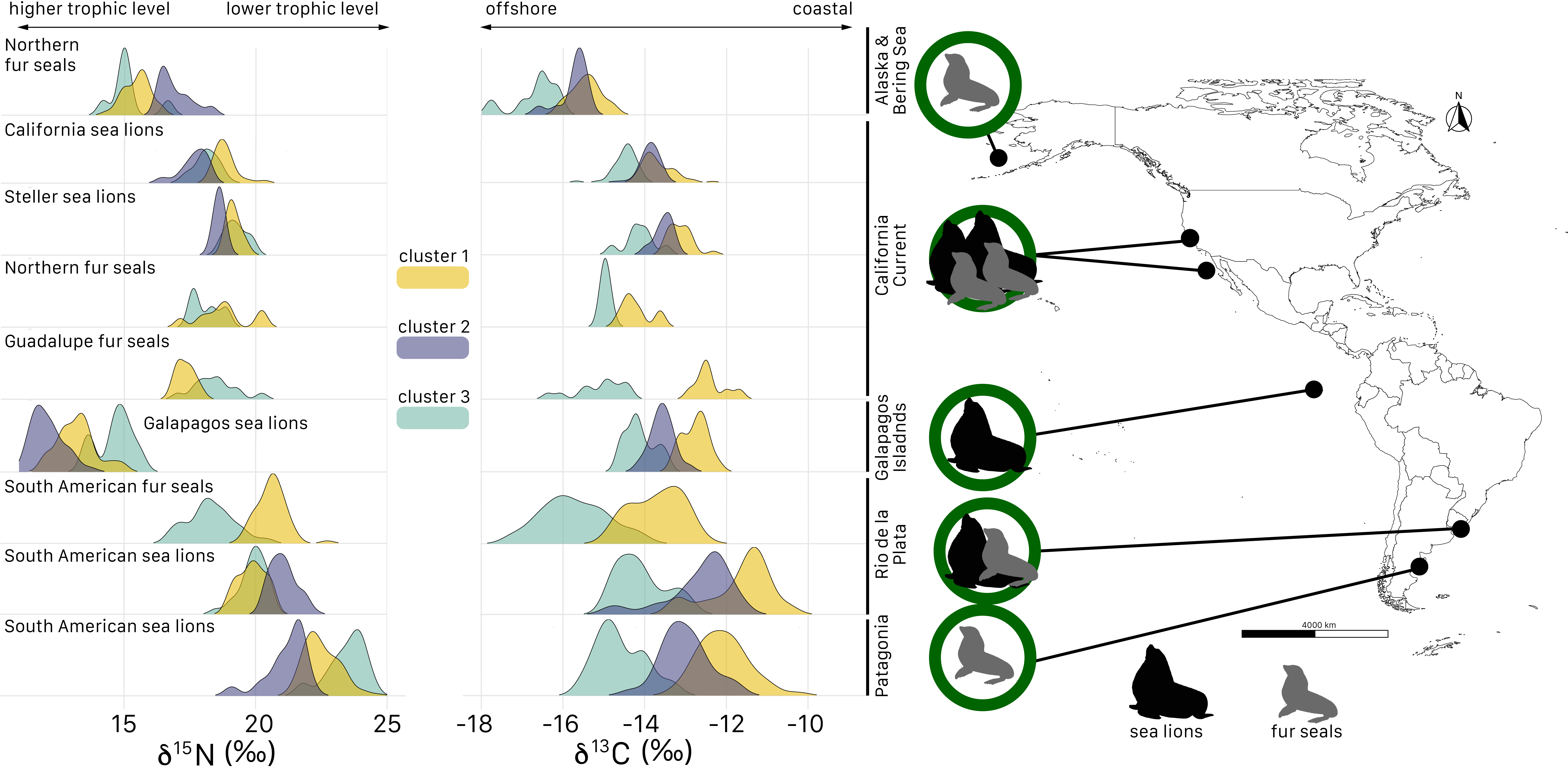
Ana Valenzuela Toro
Ecology & Evolutionary Biology PhD Student
I would describe myself as a scientist who has a basic knowledge of how to code to analyze and visualize my data.
Navigating through dynamic waters: assessing the foraging ecology of fur seals and sea lions
This figure summarizes the carbon and nitrogen isotopic composition of more than 300 individuals of fur seals and sea lions from the Northern and Southern hemispheres that I am studying for one of my dissertation chapters.
Stable isotope data were compiled in Excel and converted into CSV files. Individual CSV files were imported into R to create the density plots for each species using the libraries “ggplot2” and “ggridges.” The color of the clusters for each species was manually assigned. The map was generated in R using the libraries “sf” and “ggspatial.” Once generated, the several plots and the map were exported in PDF and then imported into Illustrator, where they were compiled to create the final figure. The otariids icons were vector graphics created in illustrator and then colored and converted in raster graphics in Photoshop to then incorporate them in the final file in illustrator. This data visualization will be used for the publication of one of my dissertation chapters.
Data collected and analyzed by Ana Valenzuela Toro.

Matthew Kustra
Ecology & Evolutionary Biology PhD Student
Scientist who uses code to run simulations, analyze, and visualize. Not too much experience with website building, but have made a few RShiny apps.
The evolutionary dynamics of non-directional cryptic female choice

This is a supplemental web application for the paper (in prep): 'The evolutionary dynamics of non-directional cryptic female choice.' Different pages on this website allow you to explore the results of this chapter of my thesis.
I ran simulations using R on the supercomputer hummingbird. I then would then take the output and process the data in R. I made both the website and all my figures in R.
Data collected and analyzed by Matt Kustra.

Linnéa Gullikson
Ecology & Evolutionary Biology Major
I am an undergraduate researcher in Mark Carr's lab and scientific illustrator working on a senior thesis on kelp forest ecosystem stability.
Drought Alterations of Aquatic Invertebrate Communities in Headwater Streams

Climate change poses a significant threat to biodiversity in Sierra Nevada headwater streams due to more frequent and prolonged periods of drought. This animation shows the impacts of drought on benthic insect communities that inhabit headwater streams.
To make this video, I used PowerPoint to animate raster graphics depicting headwater streams and invertebrates. When designing the video, I employed graphic design concepts from the Data Visualization course. This video will potentially be used in a future museum display about freshwater ecology.
Data collected and analyzed by David Herbst. Illustrations by Rae Taylor-Burns.

Kathryn Lewis
Ecology & Evolutionary Biology Major
I am an undergraduate student with a passion for both art and science. I enjoy creating artwork that centers around the ocean and marine life. I have experience working in Adobe Premiere, Adobe Illustrator, Python, as well as with acrylic painting, and pen & ink illustration
Life History Diversity and Climate Warming Effects in Spring Run Chinook Salmon Populations

Graphical Abstract that shows the effect of a warming climate on the availability of cold water pools for chinook salmon in their natal creek.
Adobe Illustrator was used to create a graphical abstract. The abstract consist of two diagrams that show the different juvenile migratory strategies observed among the successful adult spawners under wet and dry conditions, and the additional effect of water temperature increase on the amount of cold water pools available for juvenile salmon rearing.
Data collected and analyzed by Flora Cordoleani.

Jessica Kendall-Bar
Ecology & Evolutionary Biology PhD Student
I am a scientist, illustrator, and animator who uses code to analyze and visualize my data, sometimes turning the data into animations with After Effects/Maya.
Lightscapes of Fear: Risk and reward in the open ocean

This animation and interactive map displays the tracks, trip duration, and dive metadata for 8 of the 71 female northern elephant seals we incorporated in a recent study investigating the risk-reward tradeoffs of behavioral rest at sea
Data from time-depth recorder and satellite instruments were processed in MATLAB and converted into KML files. Individual KML files were imported into a single KMZ zipped file to be imported into Google Maps' "My Maps" tool, which allows users to quickly and flexibly build interactive map interfaces. Metadata was exported from MATLAB into a CSV which was then paired to the data layer containing each respective animal's track. This interactive data visualization will be incorporated in an Op-Ed we are writing for the Conversation to accompany our latest publication in Science Advances "Lightscapes of Fear: How mesopredators balance starvation and predation in the open ocean"
Data collected and analyzed by the Costa Lab at UCSC.
LEARNING CENTER
WORKSHOP RECORDINGS
Watch workshop sessions below by topic.


WORKSHOP slideS
Learn more by topic below


